
Overall I am happy with my process for systematic investing that I have been using for a few years now. It is a quantitative approach with strict rules that decide which stocks to buy. The strategy is heavily tilted towards value, momentum, profitability, growth and small size. Factors that historically have been associated with excess returns. I intend to devote several upcoming posts to describe my investment process in detail. But today I will focus on one piece that I feel is still missing from my process. Market timing. Dynamic risk management. Tactical asset allocation. There are several complicated terms that can be used, but the general idea is quite simple. To vary the portfolio’s equity allocation over time.
At the moment I have a fixed percentage of my investable capital invested in stocks. My allocation to stocks is close to 100 percent, which reflects my long-term investment horizon. However, after the extreme equity returns post-covid I have been reluctant to immediately invest new deposits in stocks. Which is the reason for my renewed interest in tactical asset allocation. Many advocate the 60/40 portfolio, 60 percent stocks and 40 percent bonds. Historically it has offered quite good risk-adjusted returns since bonds tend to do better than stocks in market downturns. However, in hindsight it is obvious that some periods were better for stocks while some were better for bonds. Would it be possible to know beforehand the potential for equity market returns in the subsequent years? It is a commonly asked question and there are plenty of arguments for why different measurements are the correct indicator for predicting future market returns. Of course, most of them are completely useless as a basis for investment decisions.
Most indicators can be sorted into one of three different categories: Valuation, Trend or Macro. I will first give a short summary of my view of each category. After that I am going to describe an alternative indicator. Finally I intend to find out how this indicator works in a Swedish context.
Valuation
There exists an almost infinite number of valuation measures which are all based on the idea that the expected market return is higher when valuation is low. This seems to be somewhat true for very long time-horizons. However, the predictive power is quite low. One example is Schiller CAPE. Another is Market cap to GDP. Personally, I already have a valuation tilt for the selection of the individual stocks.
Trend
Market price movements often follow a random walk, with an upwards tilt. But sometimes they get “caught” in a trend. That is, a market that recently have increased in price will tend to continue to rise for some time. Also, the opposite is true, a market that have decreased in price will tend to continue to fall for some time. The tendency to trend is stronger for some asset classes. For equities, the tendency to trend have historically been quite strong. The momentum trade is pretty much about capturing the excess return associated with following trends in markets. This phenomenon can also be used to adjust your asset allocation based on the trend of various assets. A well-known implementation is called GTAA, Global Tactical Asset Allocation. These strategies are very successful in backtests with historical data. However, the excess return often rely on the existence of very big, multi-year drawdowns in the market. More specifically, the positive results of the strategies often depend entirely on two single events, the burst of the IT-bubble of 2000 and the financial crisis of 2008. Therefore, the true sample size is actually extremely small, even if the backtests might cover several decades of historical data. Again, personally, I already have a momentum tilt in my selection of individual stocks to try to capture the excess return from momentum or trend.
Macro
It is very tempting to use macroeconomic indicators to try to time the market. The health of the overall economy, the rate of inflation and the interest rate ought to impact the equity markets. And indeed they do. It is especially tempting to try to predict recessions, since equities tend to perform quite badly during recessions. The problem is that most publicly available data that affect the overall market, the beta-component of equities, is priced in as soon as it is published. Or even before it is published, since the market participants trade based on their expectations. These expectations are formed gradually, often long before the actual data is available. Why would my own expectations be more correct than the expectations of other markets participants, actors with huge economic incentives to be right? Generally I am skeptical to using macro indicators. However, I still believe that there might be a little value to extract by using some of the leading recession indicators. But I think they need to be combined with other types of indicators to be effective. More on this in an upcoming post.
An alternative indicator: Average investor equity allocation
Several years ago I read an interesting post about predicting market returns, at the blog Philosophical Economics. The post is long and very insightful, as is usually the case for that blog. I do not intend to understand everything fully. But I do find the main idea very compelling and I have returned to this idea several times over the years. The idea is this: The average investor equity allocation is correlated with the subsequent long-term equity market return. The author shows that a proxy for the average investor equity allocation can be calculated from the Flow of Funds report that is released quarterly by the FED. The report is an aggregated balance sheet for all sectors in the US economy, as I understand it. The average investor equity allocation is the the sum of all equity in investor portfolios divided by all assets in investor portfolios. The problem is that a lot of bonds are held by banks, not by investors. Therefore it will not work to take the sum of all bonds in existence. A clever work-around is described in the post. An estimate of all bonds and cash that investors are holding can be obtained by taking the sum of all outstanding liabilities of all real economic borrowers.
Here is an image from the post, showing the R-squared of the alternative indicator (in yellow) compared to other popular valuation indicators:

And here is the relationship between the indicator and subsequent 10 year total return for S&P 500:
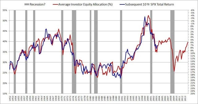
In the author’s own words:
The metric in this chart takes no input from any variables traditionally associated with valuation: earnings, book values, profit margins, discount rates, etc. It consists only of a simple ratio between two numbers that can easily be calculated in FRED. Yet, as a predictor of future stock market returns, it dramatically outperforms all other stock market valuation metrics commonly cited.
The indicator can be viewed in an interactive chart at FRED. The chart is updated with new data points each time there is a new Flow of Funds report.
Here’s some of the main takeaways, that also help to explain the rationale for why the average equity allocation should be correlated with subsequent equity market return:
- For every asset in existence, some investor must willingly hold that asset in a portfolio at all times. This is true for stocks, for bonds and for cash.
- The market is where the price of assets is decided, through trades between investors. If no investor can be found that wants to hold an asset at the current market price, then the market price will fall until a willing holder is found.
- If there is too much supply of a given asset relative to the amount that investors want to hold in their portfolios, then the the market price of the asset will fall, and therefore the supply will fall. If there is too little supply of a given asset relative to the amount that investors want to hold in their portfolios, then the market price will rise, and therefore the supply will rise.
- The economy and thus the equity market is cyclical. The investors equity allocation preference rises in expansionary parts of the cycle as people become more optimistic. It falls in contractionary parts of the cycle.
- If you buy stocks when investor equity allocation is low you will get in front of the equity supply squeeze of the next bull market.
- The supply of cash and bonds usually increase with about 5% to 15% per year. The supply of equities can rise in two ways, either through the issuance of new shares or through rising prices. The net issuance of new stock is usually very low. Therefore, the price of equities must rise over time if investors in aggregate want their equity allocation to stay constant.
I will not explain the idea in more detail here, since the original post explains it much better than I could ever do. I urge you to read the full post at Philosophical Economics.
Alpha Architect have tested if the average investor equity allocation can be a useful signal in an actual tactical asset allocation strategy. They propose an investment strategy with simple rules to decide when to switch between bonds and equity, based on the average investor equity allocation. They backtest the strategy during the period 1970-2020. Thus, this backtest also functions as an out-of-sample test (for the period 2013-2020). The backtest shows that this alternative indicator works fairly good as a signal for tactical asset allocation. It has the highest CAGR when compared with several well-known valuation indicators, such as CAPE.
The average investor equity allocation in Sweden
I have been planning on testing this alternative indicator in a Swedish context since I first read about it at Philosophical Economics. But I never quite got around to it. Until now.
The first challenge was to find the Swedish equivalent to the Flow of Funds report in the US. After some searching I think I have found it here, at SBC’s Statistikdatabas.
The next step was to understand the naming of the equivalent accounts in Swedish. Among other things I learned that the Swedish equivalent to “debt securities” is “räntebärande värdepapper”. Here is what I ended up using from Statistikdatas, for each account that is used by Philosophical Economics and FRED.
A. Nonfinancial Corporate Business, Corporate Equities:
- Ställningsvärden – S11 Icke-finansiella bolag – FA5100 Aktier och andra ägarandelar
B. Domestic Financial Sectors, Corporate Equities:
- Ställningsvärden – S12 Finansiella bolag – FA5100 Aktier och andra ägarandelar
C. Nonfinancial Corporate Business, Debt Securities and Loans:
- Ställningsvärden – S11 Icke-finansiella bolag – FA3000 Räntebärande värdepapper, totalt
- Ställningsvärden – S11 Icke-finansiella bolag – FA4000 Lån, totalt
D. Households and Nonprofit Organizations, Debt Securities and Loans:
- Ställningsvärden – S14 Hushåll – FA3000 Räntebärande värdepapper, totalt
- Ställningsvärden – S14 Hushåll -FA4000 Lån, totalt
- Ställningsvärden – S15 Hushållens icke-vinstdrivande organisationer – FA3000 Räntebärande värdepapper, totalt
- Ställningsvärden – S15 Hushållens icke-vinstdrivande organisationer – FA4000 Lån, totalt
E. Federal, State and Local Government, Debt Securities and Loans:
- Ställningsvärden – S13 Offentlig förvaltning – FA3000 Räntebärande värdepapper, totalt
- Ställningsvärden – S13 Offentlig förvaltning – FA4000 Lån, totalt
F. Rest of the World; Debt Securities and Loans:
- Ställningsvärden – S2 Utlandet – FA3000 Räntebärande värdepapper, totalt
- Ställningsvärden – S2 Utlandet – FA4000 Lån, totalt
All data series can be downloaded from Statistikdatabasen. With this data it is very easy to calculate the average investor equity allocation by taking the sum of all corporate equity and divide it by the sum of all corporate equity and the sum of the total liabilities of all real economic borrowers. That is:
(A + B) / (A + B + C +D + E + F)
The result can be seen in the chart below. The blue line is the average investor equity allocation in Sweden (left y-axis). The red line is the subsequent 10 year real return for the Swedish stock market index OMXS30, expressed in percent as CAGR (right y-axis). Note that the right y-axis is inverse.
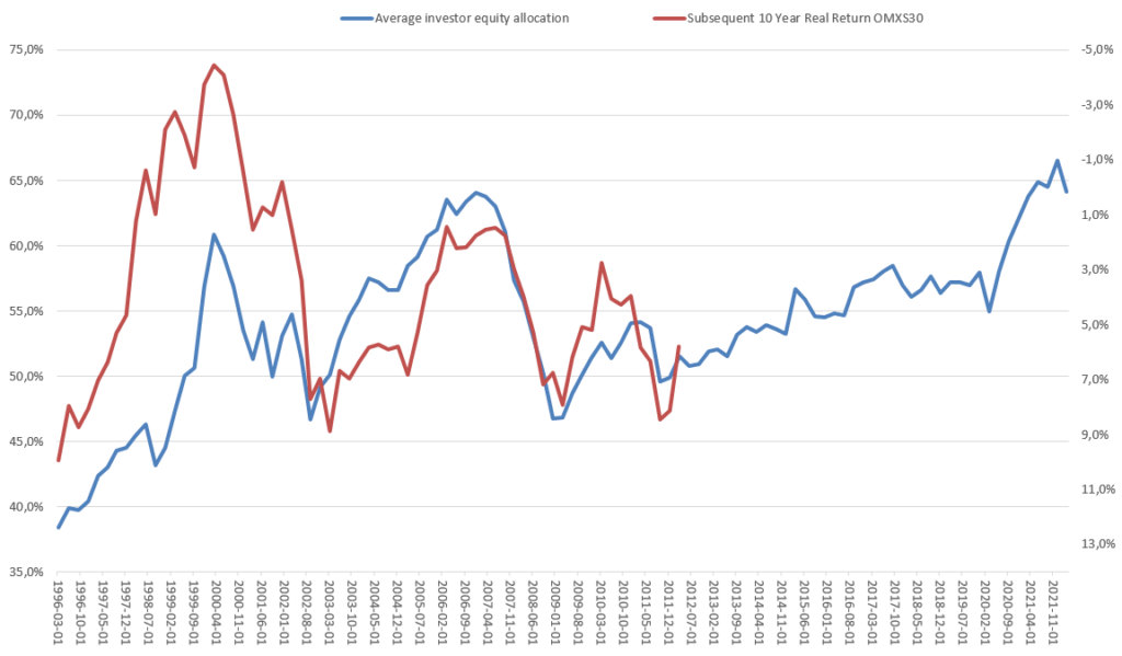
From just looking at the chart we can see that there is some kind of relationship between the two series. However, it is far from a perfect fit. Actually, the R-squared is only a meager 0,31 for the whole time period. It seems that something changed around 2003. If you divide the data in two parts, we find that up to 2003 the R-squared is 0,78 and after 2003 it is 0,79. However, it is still lower than what Philosophical Economics were able to show for the US. And there is not a linear relationship that is stable throughout the whole period.
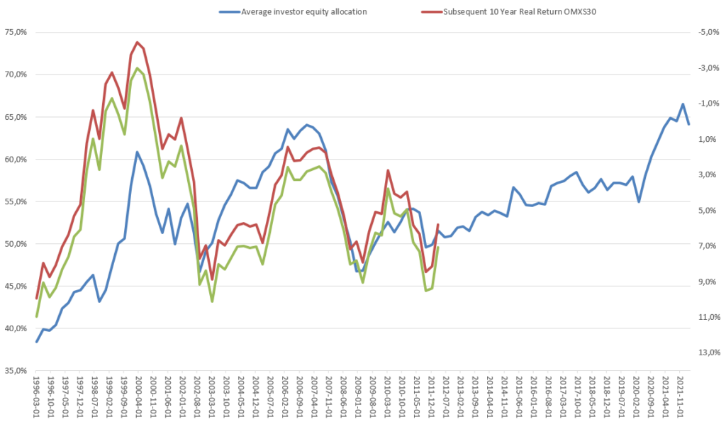
In the chart above I have used real returns, inflation adjusted by using the Swedish Consumer Price Index (KPI) from here. The overall picture does not change if we use nominal returns instead, as can be seen in the chart below. The green line is the subsequent 10 year nominal return for the Swedish stock market index OMXS30.
I would prefer to use total returns that also includes dividends, instead of a price index. However, I could only find free data going back to 2002 for OMXSGI, the total return index. Here it is in yellow, in the chart below. The correlation is actually a bit higher, with an R-squared of ~0,86, compared to ~0,78 for the price index for the same period. But this is obviously not enough data to prove anything.
The stock index data is from Nasdaq Nordic.
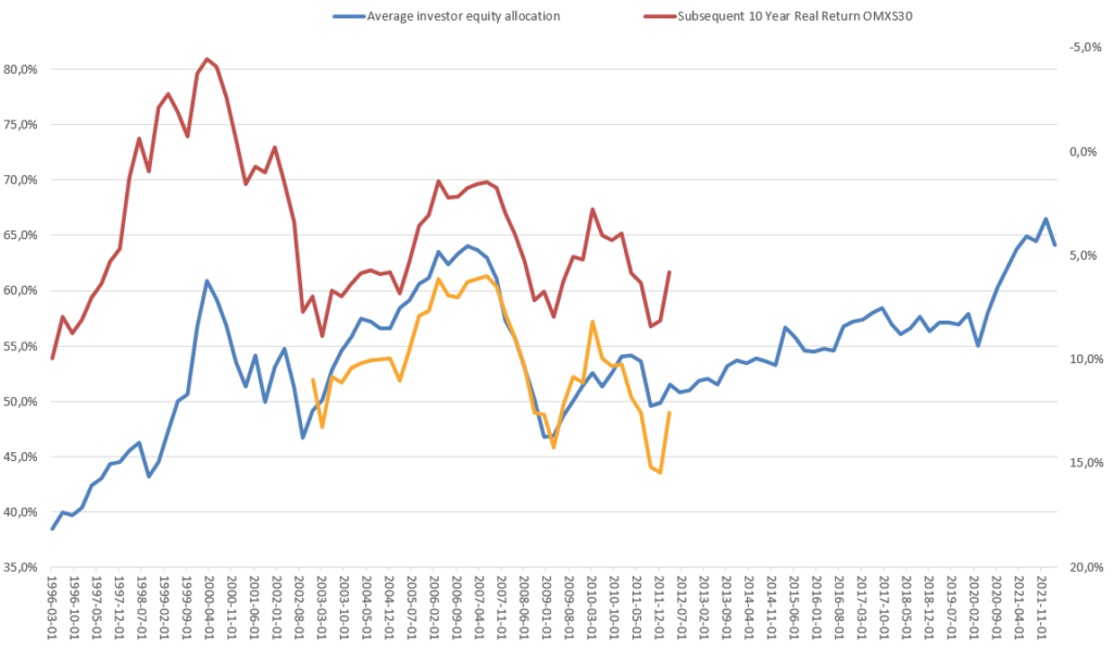
This is clearly not enough to make me feel confident in trying to use this indicator for making real investment decisions. However I am not ready to give up my search for a predictor of market return. I am not even finished yet with my investigations of the average investor equity allocation.
Some of the questions I want to investigate further:
- What is the correlation further back in time? I have found older data sets in Statistikdatabasen for the financial accounts going back to 1970. Now I also need to find data for the stock market index going back that far. Preferably the total return index. That should be the easy part, but I actually have not found any free source for this yet.
- Why is there not a stable linear relationship between the equity allocation and the subsequent market return through the whole time period? Did something change after the IT-bubble that affected the relation? The equity allocation in Sweden seems to be lower during the IT-bubble than it was before the financial crisis of 2008. While in the US it is much higher during the IT-bubble. Is this correct, or am I using the data in some incorrect way?
- Does the delay in reporting of the financial accounts impact the predictive power of the indicator? The results for one quarter is not reported until more than one whole quarter later. For example, the Q1 data is reported in July. Would it be possible to approximate the current average investor equity allocation by adjusting for how the prices of equities and bonds have changed since the end of last quarter?
- Can investor surveys be used instead? There are publicly available surveys where investors are asked how high their equity exposures are. Will they show the same correlation to subsequent equity market returns?
- Granted that I eventually find an indicator with predictive power, how could I incorporate this into my investment process? I need to decide upon a lot of concrete implementation details. At what level of average investor equity allocation would I reduce my equity exposure and what would be required for me to increase it again? How do I minimize turnover and associated fees? Is there some other Growth or Trend indicator that I should use in combination?
Leave a Reply