I have been working on-and-off with this game, now called Hamster Valley, since 2017. There have been several pivots during the years. I am going to write a historic overview that describe how the design have evolved. However, in this first Design Diary I want to focus on what I have been working on the last couple of weeks.
I recently decided to have Hamster Valley as my main focus for now. I also decided set more ambitious goals for the game, since I will now devote a lot of time and energy on Hamster Valley. Before I had the idea to make this a print-on-demand game on The Game Crafter. This meant simple, small components that could fit in a small game box. Now, unconstrained by the limited components I had before, I am redesigning many game components. I have also made several bigger changes to the rules.
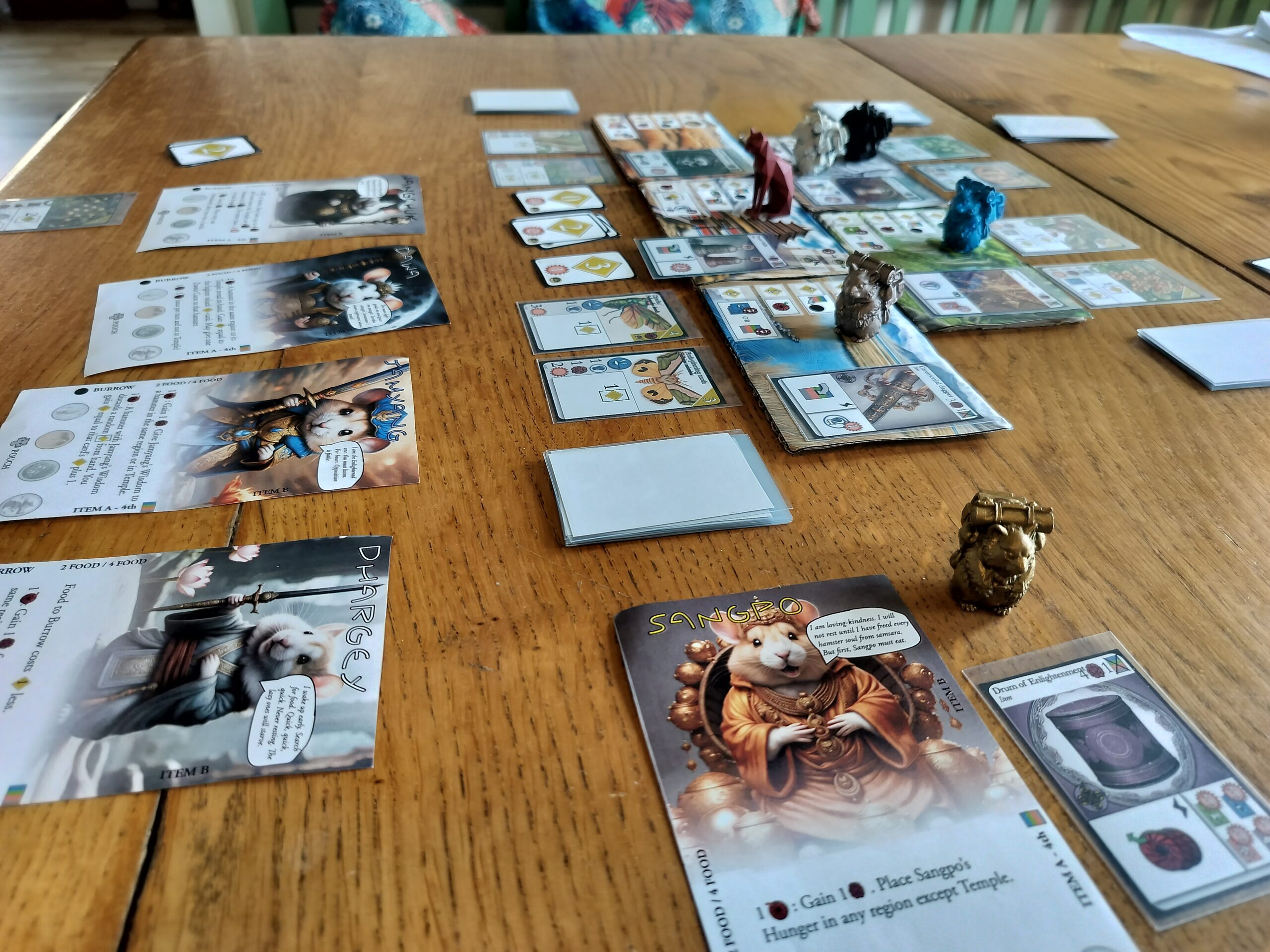
Please note that all images are work in progress as part of a prototype.
Re-evaluating what is important
I started this pivot by critically evaluating what is most important in the game. This is what I came up with:
The rush to get enough food and points before winter arrives or before someone ends the game.
Memorable stories to tell each other from the fights for territory. Feeling of being through an adventure together.
Compete against the other hamsters to get the magical Items you need.
Enough strategic depth to intrigue experienced gamers, but still easy to teach to an inexperienced gamer. If necessary, with the help of a Family mode.
Making your hamster more powerful by improving your tableau, as the game progresses.
Differentiated ways to get points, while still keeping the Food collection a main source of points.
Beautiful and functional components that works well with the theme and the mechanics of the game.
Main changes and the reasons why
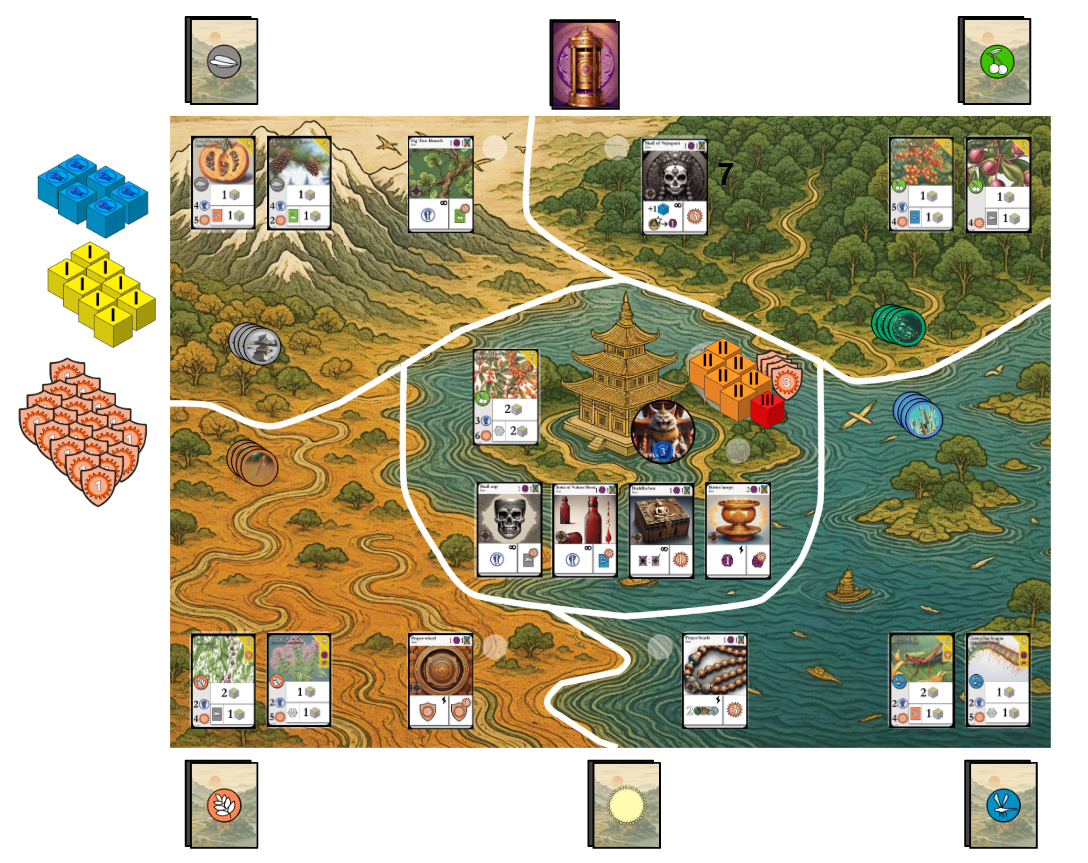
A big and beautiful game board
Created a proper game board with the four regular territories and the Temple territory in the middle. Now the cards that belong to each territory actually can fit within that area on the game board. This give the players a better overview of what actions are available in each territory.
Reason: Beautiful and functional components that works well with the theme and the mechanics of the game. Reduce complexity.
Bye bye energy deck – Welcome energy dice!
Energy dice instead of the energy cards deck. The strength cards deck is also replaced by custom dice. This eliminated the last remnants of deck building from the game – which I believe is a good thing. Hamster Valley is now a tableau building game at its core, while the dice add excitement and some healthy uncertainty.
Reason: Beautiful and functional components that works well with the theme and the mechanics of the game. Memorable stories to tell each other from the fights for territory. Making your hamster more powerful by improving your tableau, as the game progresses.
Merge two resources into one (bye bye Exhaustion)
Merged the two resources Focus and Exhaustion into one resource – only Focus. This also allowed me to completely remove the (quite complicated) mechanics for generating Focus from your Food cards.
Reason: Reduce complexity.
Burrow expansion changes
Simplified rules for expanding your Burrow. 1 Material = 1 space for Food cards in Burrow. For a maximum of 4 cards in Burrow.
Reason: Reduce complexity.
Control over territories
Implement a mechanic that allows players to gain control over the regular territories. Control of a territory will let you get the Item cheaper. Each territory you control also give you one bonus re-roll of the energy dice each turn.
Reason: Memorable stories to tell each other from the fights for territory. Compete against the other hamsters to get the magical Items you need. Making your hamster more powerful by improving your tableau. Strategic depth.
The Temple cat as a common enemy
The Temple cat is now a common enemy, that can be defeated together. This is made possible by introducing “armor” for the cat, which means it requires three successful attacks to defeat the cat. It could be the same player that attacks all three times, but more often it will be a combined effort. Every successful attack still give the attacker a personal reward. But there is also a collective reward that is distributed to every player when the cat is defeated.
Reason: Memorable stories to tell each other from the fights. Feeling of being through an adventure together. Strategic depth.
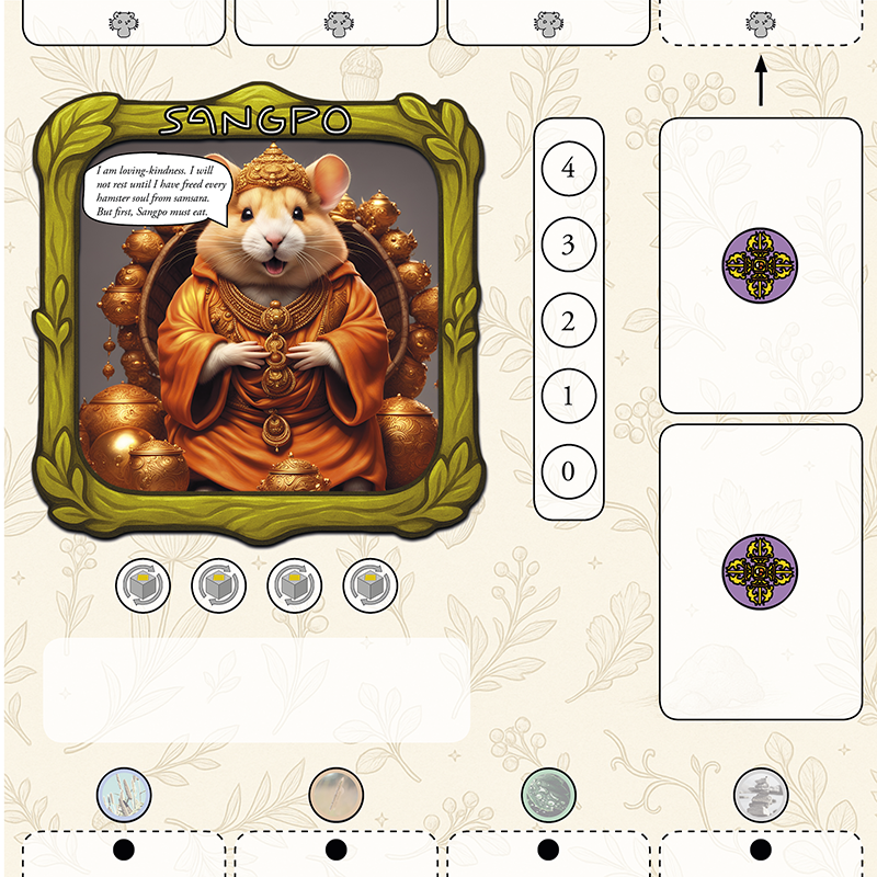
New bigger player mats
Redesigned the player mats with the hamsters. Now with much bigger dimensions. This allows for a much clearer and more coherent design. The layout and graphical elements on the player mat will intuitively show the card limit for both the Pouch and the Burrow. This was one of the main challenges with the old player mat design.
Reason: Beautiful and functional components that works well with the theme and the mechanics of the game. Reduce complexity and rules that are easy to explain.
What I will be working on next
The focus next week will be to update my old mod at Tabletop Simulator and get some playtesting going!
Starting today I will work 3 days/week developing my games. For one year!
Equal amounts excitement and fear.
I will write about my journey here as well as on Instagram, X and Board Game Geek. My first priority is to restart the development of my old prototype for a hamster themed strategic tableau building game.
It is late afternoon, early in April. We depart with the night train from Sweden amidst snow-covered fields and fir trees. Twenty-two hours later we are greeted by the sun and warmth in Paris.
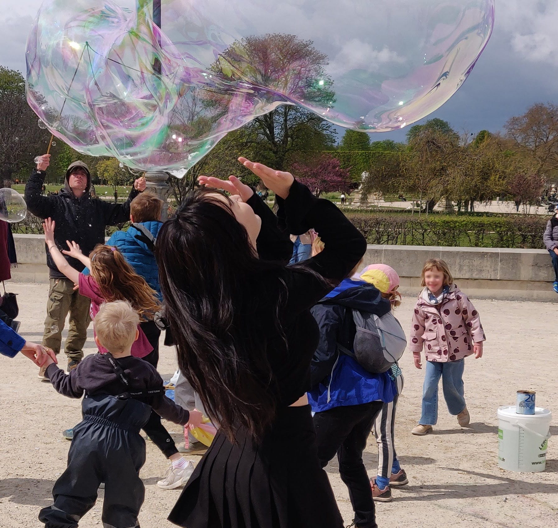
We are two families traveling together. Four adults and four kids, aged four to six. The plan is to stay two days in Paris and then continue to Lyon. We spend the first full day in Paris in walking mode. We stay on the north side of Seine. There is a big demonstration planned on the other side that we would like to avoid. The Eiffel Tower can be seen in the distance and we point towards it with excitement to show the kids. They are not particularly impressed. They are, however, very excited when we reach Louvren. It is not the building that have peaked their interest. It’s the Bubble man. A young man is earning some money by making gigantic soap bubbles for the tourists. We spend a long time there, eating ice cream and watching the soap bubbles. Our children join a big crowd of kids, running after the bubbles while trying to catch them before they hit the ground. Eyes glimmering of excitement.
It’s evening and we are back in our apartment again. My clock have registered more than fifteen thousand steps. Even our youngest have walked most of the day as well. I am always amazed at their ability to walk long stretches, as long as the route and pace is flexible. And as long as their bellies are full. We are planning our next day in Paris where the main event is to visit the Eiffel Tower. Suddenly my wife exclaims:
“All the trains for Lyon tomorrow are fully booked!”
After a pause, she continues:
“Wait, there’s one train that doesn’t require booking – but it departs at seven’o’clock in the morning.”
Long story short, we decide to save the Eiffel Tower for another time and make for an early night.
The taxi drops us off at Gare de Garcy the next morning. The man at the help desk confirms that our Interrail is valid on the train. He ends by saying:
“But you have to fight for a seat.”
We fight, and we prevail. (It is a rather peaceful fight, we gently ask a passenger if we could change seats.)
Lyon – exploring the city between the two hills
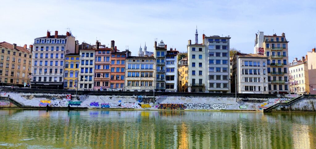
We stay at Pilo Hotel, situated at walking distance to the three notable historical districts of Lyon: Croix-Rousse, Vieux Lyon and Fourvière. These districs are all part of the “Historic Site of Lyon” – an UNESCO World Heritage. We know we want to explore these districts. Apart from that we do not have any fixed plans for our stay in Lyon.
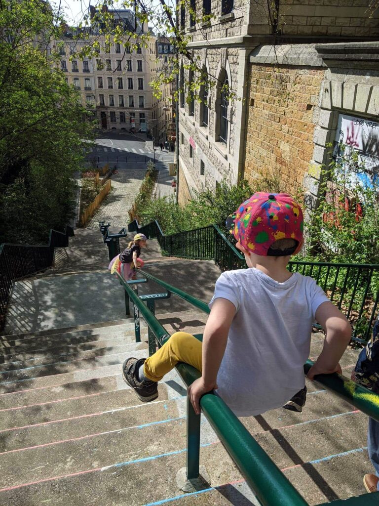
Each stair is an opportunity for play
As we go out to explore our new surroundings, the kids immediately find opportunities to use the city as a playground. The rails along the steps down the hills of Croix-Rousse turns out to be perfect for sliding. The joys of a hilly city.
Coke is the best motivation for learning French
One day we find ourselves at a small creperie along a quiet backstreet in Croix-Rousse. There is a sign on the door that said “Fermé”. We are not sure what it means. The door is open so we go inside and order some crepes.
The two six-year-olds want to sit by themselves at the bar counter, where they can watch the food being prepared. After a while they ask us if they can get a Coca cola. We tell them that they can have one if the manage to order one by themselves. We tell them how to say “s’il vous plait”. They go back to the bar counter and we can hear them whisper to each other, practicing and discussing what to tell the man behind the counter. Finally, we hear them speak out loud:
“S’il vous plait, coca cola.”
After a short while they come over to us with one coke each. Triumphant smiles.
Even us adults learn some French that day. When we finally google “fermé” we learn what it means – closed.
The kids decide where to go next
Last day in Lyon. We ask what the kids want to do.
“Go up and down the hill with the railway.”
There is a funicular, a cable railway along a steep slope, going up to the Fourvière hilltop. The line, which is about 400 meters long with a 30% incline, was opened in 1900 and renovated in 1970.
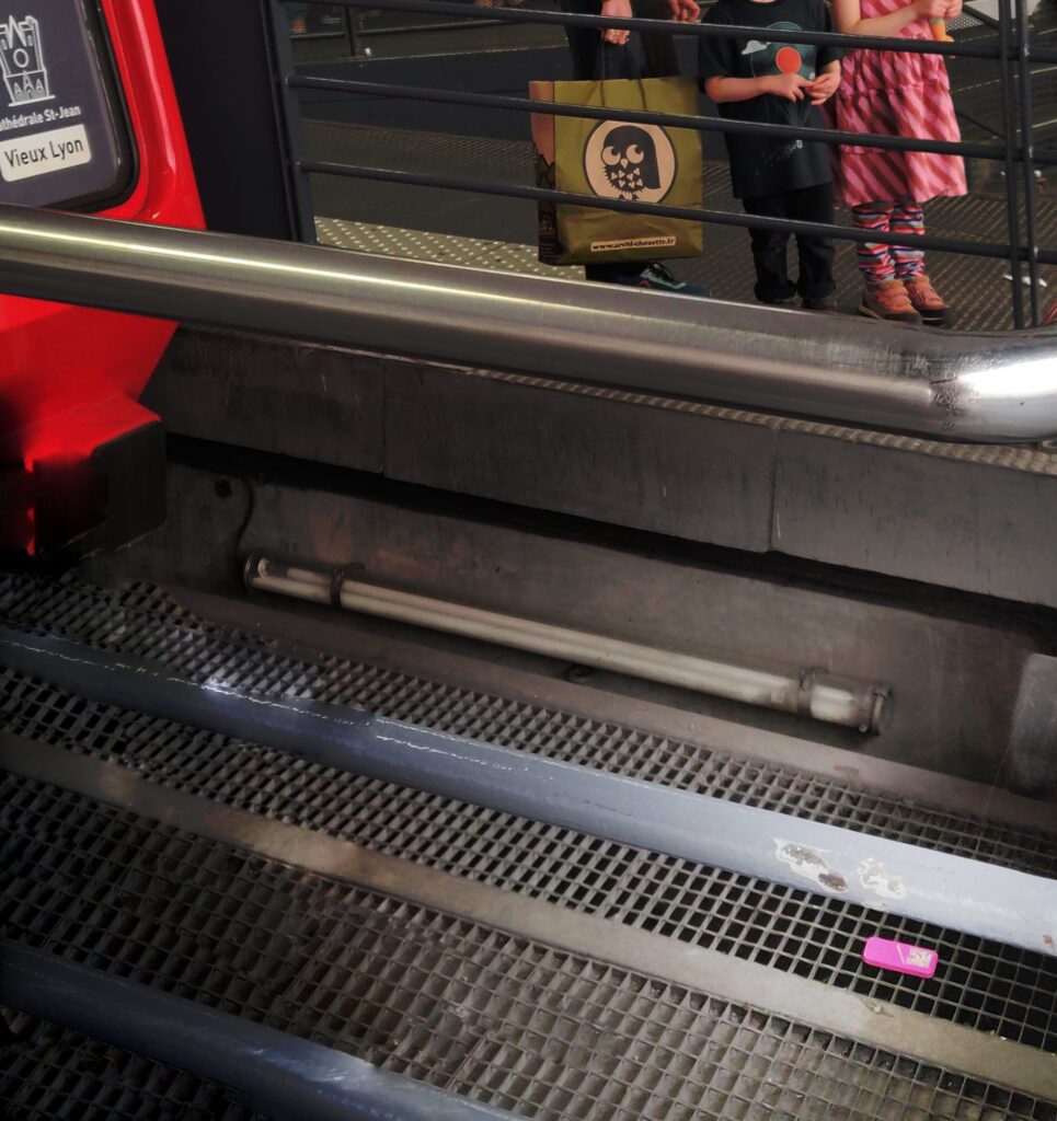
We walk to the station at Saint-Jean, taking several stops along the way to play, shop and eat. The kids wait eagerly at the platform as the funicular car approaches. There is a sudden cry of panic. Our six-year-old have dropped her pink play-phone down on the rail tracks. She has an outburst of anxiety and is crying. We manage to calm her somewhat and then ask the railway driver to help us fetch the phone. He asks us to wait and walks away. Then follows some tense minutes of waiting. Perfect opportunity to practice the art of staying calm, when faced with hardship and uncertainty. Finally, another man approaches, climbs down on the track to fetch the phone and hands it over to the young owner. She is very relieved.
The continued trip with the funicular railway is very enjoyable. The kids sit in the front and watch the car being pulling by the cable along the steep incline in the dimly lit tunnel. Intense focus.
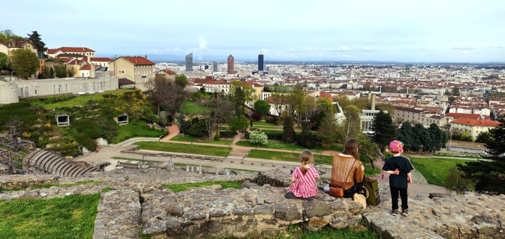
We walk to the ancient Roman theater at Fourvière. We explore the ruins together. Trying to guess the original function of the different tunnels, rooms and walls. The kids want to climb the remnants of the walls behind the cavea. We find a beautiful spot with remarkable views towards the city center of Lyon. The mountains visible in the distance – a shimmering, blue backdrop to the mosaic of white facades and orange brick roofs. I ask the four-year-old to sit down, even though the wall he stands on is not really that high. He respons:
“If I stand up I can see farther. I can even see the mountains.”
He is right, of course. He remains standing. We look toward the mountains together.
The 5 lessons from this trip – and for the next
Choose destinations based on the World heritage sites
Lots of spectacular views and historical settings to explore. Medieval road networks is a nightmare for urban planners, trying to optimize traffic flows. But they are very pleasant to explore as a tourist. See the full list at UNESCO World Heritage List.
Stay in locations where you can mostly move by foot
One part of this is the actual distance to amenities and activities. The other part is the walkability of the area. Google Maps works great for an initial assessment.
Only plan ahead the bare minimum that you need to be able to feel safe and relaxed
For me that usually means to book stay for all nights. I put more effort into understanding the surrounding area and not that much into the actual hotel or apartment. I might write down a few activities that seems interesting, but not much more than that. Activities that require pre-booking for a specific time is a big no-no. The loss of flexibility and spontaneity is not worth it.
Make room for play
Kids find meaning in activities through play (this is true for adults as well, the only difference is that we don’t usually call the games we play as ‘playing’ – we call it ‘working’, ‘exercising’ or ‘dating’). This is essential for an enjoyable trip with our kids. We try to redefine the paths we have to walk with a mindset of playing. Run as fast as you can to the next lamp post. Pause for five minutes to let the kids watch a boat pass by. Go back up the same stairs for the fifth time, to let the kids slide down the rails for one last (really?) time. If the route is difficult to redefine (2 km along a monotonous road), try to adjust the route to a more play-friendly one. Try the longer route along the water instead.
I have to remind me of this constantly. Otherwise it is easy for me to get stuck in an “effective” mindset, narrowly striving to reach the destination as fast as possible. In the end we might have reached the destination ten minutes earlier. But what have I really achieved? Nothing. The kids are angry. I feel miserable for having pushed them too hard. There is a need to push through sometimes – to catch a train or for some other reason. But it is certainly not an “effective” method for creating an enjoyable family holiday.
The ordinary activities brings meaning – if you allow for it
It is often the “small” and spontaneous experiences that turn out to be the most significant and memorable. These things can not be planned for in advance. Your task is to take care of the basics and then leave lots of room in your schedule. The kids will provide for spontaneity. Together you will find meaning – if you allow for it.
Lately I have seen a lot of example of AI generated images in my Twitter feed. The new Stable Diffusion AI have been mentioned. Recently the code and all necessary stuff to run the code was released to the public. I have not yet tried to install it on my computer. I am not even sure it will run on my laptop with Iris Xe graphics.
I were still very eager to try some prompts with Stable Diffusion. After some searching I found out that it is actually made available in a very user friendly and easy way at NightCafé. You get to generate a few images for free each day. If you want to do more you can sign up for a subscription or buy credits that can be used to generate more images. I could not resist the temptation, so I got some credits and started generating images like a mad man. Let me share some results after my first two days of AI frenzy.
Test #1
Goal: Generate a beautiful visualisation of a dreamlike cityscape. Highly detailed painting. Beautiful lighting. Vivid colors.
Prompt: City in sunset, Sweden, Balboa trees, 8k, 4k, intricate details, vibrant colors, high focus, unreal 5 render, rhads, Bruce Pennington, Studio Ghibli, tim hildebrandt, digital art, octane render, beautiful composition, trending on artstation, award-winning photograph, masterpiecePrompt: City in sunset, gothenburg, Sweden, snow and ice, glimmering, extremely detailed oil painting, intricate details, unreal 5 render, rhads, Bruce Pennington, Studio Ghibli, tim hildebrandt, digital art, octane render, beautiful composition, trending on artstation, award-winning photograph, masterpiece”This one I really like. Prompt: City in sunrise, Balboa trees, 8k, 4k, intricate details, vibrant colors, high focus, art noveau, unreal 5 render, rhads, Bruce Pennington, Studio Ghibli, tim hildebrandt, digital art, octane render, beautiful composition, trending on artstation, award-winning photograph, masterpiecePrompt: Art noveau city and colorful Balboa trees in sunrise as William Turner, epic in scope and scale, 8k, intricate details, vibrant colors, impressionism, high focus, unreal 5 render, Bruce Pennington, tim hildebrandt, studio Ghibli, digital art, octane render, beautiful composition, trending on artstation, masterpiece
The results turned out better than I expected. I find the images very beautiful and the composition feels strikingly coherent, compared to earlier iterations of AI image generators. I would love to have some of these images as prints at home. It is interesting to note the difference in style in the last image where I added William Turner and impressionism.
Test #2
Goal: Generate colorful and highly detailed portraits inspired by Egypt gods.
Ibis. Prompt: Egypt godess of the underworld ibis, intricate green and gold design, highly detailed, sharp focus, art by artgerm and greg rutkowski and wlop, detailed painting, 8k resolution concept art, hyperdetailed, polished illustration, impressionism, vivid colorsOne of the generated images above. Upscaled 6x by the AI scaling at NightCafé.Osiris. Prompt: Egypt old male god of the underworld osiris, intricate white and gold design, highly detailed, sharp focus, art by artgerm and greg rutkowski and wlop, detailed painting, 8k resolution concept art, hyperdetailed, polished illustration, impressionism, vivid colors, symbolismSekhmet. Prompt: Egypt goddess of the lions sekhmet, intricate red and gold design, highly detailed, sharp focus, art by artgerm and greg rutkowski and wlop, detailed painting, 8k resolution concept art, hyperdetailed, polished illustration, impressionism, vivid colors, mythicalSome tests turned out a bit weird. Prompt: Egypt god Thoth by Anna Dittmann and Alphonse Mucha. Incredibly detailed, maximalist matte painting. Portrait of a god. Polished illustration. Colorful hue of green, gold, black. Glimmering darkness. 8K resolution, HD, DSLR, realistic oil painting.
Test #3
Goal: Generate a profile image for me and for this blog that encapsulates the phrase “urban meeple”.
This is the one I like the most so far. It took some trial and error to get there. Prompt: A chess piece in a cyberpunk city by Simon Stålenhag, Irina French, Paul Gauguin, Dan Mumford, Cyril Rolando trending on Artstation hyperdetailed Unreal Engine romanticism filmic photorealistic post-apocalyptic sci-fi digital illustration. Vibrant colors. Chess Queen. Epic scale.”First try. Beautiful images, but the AI did not pick up on the phrases game pawn or meeple. Prompt: A game pawn in a cyberpunk city by Irina French, Paul Gauguin, Dan Mumford, Cyril Rolando trending on Artstation hyperdetailed Unreal Engine romanticism filmic photorealistic post-apocalyptic sci-fi digital illustration. Vibrant colors. Urban MeepleSecond try. The AI makes the pawn or chess piece as big as a building and the shape is often very abstract. Prompt: A very big chess piece in a cyberpunk city by Simon Stålenhag, Irina French, Paul Gauguin, Dan Mumford, Cyril Rolando trending on Artstation hyperdetailed Unreal Engine romanticism filmic photorealistic post-apocalyptic sci-fi digital illustration. Vibrant colors. Chess Queen. Epic scale.”
This is so much fun to play around with! I need to get a proper graphics card and install Stable Diffusion on my own computer. Or else I will use up all my money to buy computing time at NightCafé instead.
Some of the prompts that are circling around in the community is hilarious. One very common phrase is “unreal 5 engine”, another one is “trending on artstation”. These are added to the prompt almost by routine, with the hope that it will improve the quality of the generated images. And maybe they do. After all, I guess a large part of the dataset that the AI has trained on is composed of images from Artstation, and the ones that are trending there are usually spectacular images And images based on the unreal engine really can be extremely photorealistic. But I have also seen very impressive images without these trendy phrases. It is also fun to see what artist names are used in the prompts in order to simulate their particular style. Artgerm, Greg Rutkowski and WLOP are extremely popular and they are often used in combination on prompts. Studio Ghibli is also frequent. It’s almost like a magic spell used to summon a demon or a creature from the other side. Instead of searching some old dark magic book in a library for a spell, you search the community image archive for prompts.
It is really exciting to hit the button labeled “Create”, then wait to see what will appear. Almost as exciting as it is to find out what creature was summoned in the magic ritual in the fantasy story. Was it what you were hoping for or was it something completely different, an abomination? Maybe I should have added “unreal 5 engine” or “hyperdetailed” to the spell…eh, I mean…to the prompt.
Overall I am happy with my process for systematic investing that I have been using for a few years now. It is a quantitative approach with strict rules that decide which stocks to buy. The strategy is heavily tilted towards value, momentum, profitability, growth and small size. Factors that historically have been associated with excess returns. I intend to devote several upcoming posts to describe my investment process in detail. But today I will focus on one piece that I feel is still missing from my process. Market timing. Dynamic risk management. Tactical asset allocation. There are several complicated terms that can be used, but the general idea is quite simple. To vary the portfolio’s equity allocation over time.
At the moment I have a fixed percentage of my investable capital invested in stocks. My allocation to stocks is close to 100 percent, which reflects my long-term investment horizon. However, after the extreme equity returns post-covid I have been reluctant to immediately invest new deposits in stocks. Which is the reason for my renewed interest in tactical asset allocation. Many advocate the 60/40 portfolio, 60 percent stocks and 40 percent bonds. Historically it has offered quite good risk-adjusted returns since bonds tend to do better than stocks in market downturns. However, in hindsight it is obvious that some periods were better for stocks while some were better for bonds. Would it be possible to know beforehand the potential for equity market returns in the subsequent years? It is a commonly asked question and there are plenty of arguments for why different measurements are the correct indicator for predicting future market returns. Of course, most of them are completely useless as a basis for investment decisions.
Most indicators can be sorted into one of three different categories: Valuation, Trend or Macro. I will first give a short summary of my view of each category. After that I am going to describe an alternative indicator. Finally I intend to find out how this indicator works in a Swedish context.
Valuation
There exists an almost infinite number of valuation measures which are all based on the idea that the expected market return is higher when valuation is low. This seems to be somewhat true for very long time-horizons. However, the predictive power is quite low. One example is Schiller CAPE. Another is Market cap to GDP. Personally, I already have a valuation tilt for the selection of the individual stocks.
Trend
Market price movements often follow a random walk, with an upwards tilt. But sometimes they get “caught” in a trend. That is, a market that recently have increased in price will tend to continue to rise for some time. Also, the opposite is true, a market that have decreased in price will tend to continue to fall for some time. The tendency to trend is stronger for some asset classes. For equities, the tendency to trend have historically been quite strong. The momentum trade is pretty much about capturing the excess return associated with following trends in markets. This phenomenon can also be used to adjust your asset allocation based on the trend of various assets. A well-known implementation is called GTAA, Global Tactical Asset Allocation. These strategies are very successful in backtests with historical data. However, the excess return often rely on the existence of very big, multi-year drawdowns in the market. More specifically, the positive results of the strategies often depend entirely on two single events, the burst of the IT-bubble of 2000 and the financial crisis of 2008. Therefore, the true sample size is actually extremely small, even if the backtests might cover several decades of historical data. Again, personally, I already have a momentum tilt in my selection of individual stocks to try to capture the excess return from momentum or trend.
Macro
It is very tempting to use macroeconomic indicators to try to time the market. The health of the overall economy, the rate of inflation and the interest rate ought to impact the equity markets. And indeed they do. It is especially tempting to try to predict recessions, since equities tend to perform quite badly during recessions. The problem is that most publicly available data that affect the overall market, the beta-component of equities, is priced in as soon as it is published. Or even before it is published, since the market participants trade based on their expectations. These expectations are formed gradually, often long before the actual data is available. Why would my own expectations be more correct than the expectations of other markets participants, actors with huge economic incentives to be right? Generally I am skeptical to using macro indicators. However, I still believe that there might be a little value to extract by using some of the leading recession indicators. But I think they need to be combined with other types of indicators to be effective. More on this in an upcoming post.
An alternative indicator: Average investor equity allocation
Several years ago I read an interesting post about predicting market returns, at the blog Philosophical Economics. The post is long and very insightful, as is usually the case for that blog. I do not intend to understand everything fully. But I do find the main idea very compelling and I have returned to this idea several times over the years. The idea is this: The average investor equity allocation is correlated with the subsequent long-term equity market return. The author shows that a proxy for the average investor equity allocation can be calculated from the Flow of Funds report that is released quarterly by the FED. The report is an aggregated balance sheet for all sectors in the US economy, as I understand it. The average investor equity allocation is the the sum of all equity in investor portfolios divided by all assets in investor portfolios. The problem is that a lot of bonds are held by banks, not by investors. Therefore it will not work to take the sum of all bonds in existence. A clever work-around is described in the post. An estimate of all bonds and cash that investors are holding can be obtained by taking the sum of all outstanding liabilities of all real economic borrowers.
Here is an image from the post, showing the R-squared of the alternative indicator (in yellow) compared to other popular valuation indicators:
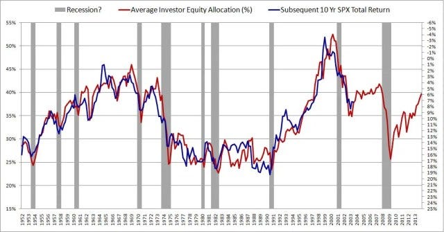
And here is the relationship between the indicator and subsequent 10 year total return for S&P 500:
In the author’s own words:
The metric in this chart takes no input from any variables traditionally associated with valuation: earnings, book values, profit margins, discount rates, etc. It consists only of a simple ratio between two numbers that can easily be calculated in FRED. Yet, as a predictor of future stock market returns, it dramatically outperforms all other stock market valuation metrics commonly cited.
The indicator can be viewed in an interactive chart at FRED. The chart is updated with new data points each time there is a new Flow of Funds report.
Here’s some of the main takeaways, that also help to explain the rationale for why the average equity allocation should be correlated with subsequent equity market return:
For every asset in existence, some investor must willingly hold that asset in a portfolio at all times. This is true for stocks, for bonds and for cash.
The market is where the price of assets is decided, through trades between investors. If no investor can be found that wants to hold an asset at the current market price, then the market price will fall until a willing holder is found.
If there is too much supply of a given asset relative to the amount that investors want to hold in their portfolios, then the the market price of the asset will fall, and therefore the supply will fall. If there is too little supply of a given asset relative to the amount that investors want to hold in their portfolios, then the market price will rise, and therefore the supply will rise.
The economy and thus the equity market is cyclical. The investors equity allocation preference rises in expansionary parts of the cycle as people become more optimistic. It falls in contractionary parts of the cycle.
If you buy stocks when investor equity allocation is low you will get in front of the equity supply squeeze of the next bull market.
The supply of cash and bonds usually increase with about 5% to 15% per year. The supply of equities can rise in two ways, either through the issuance of new shares or through rising prices. The net issuance of new stock is usually very low. Therefore, the price of equities must rise over time if investors in aggregate want their equity allocation to stay constant.
I will not explain the idea in more detail here, since the original post explains it much better than I could ever do. I urge you to read the full post at Philosophical Economics.
Alpha Architect have tested if the average investor equity allocation can be a useful signal in an actual tactical asset allocation strategy. They propose an investment strategy with simple rules to decide when to switch between bonds and equity, based on the average investor equity allocation. They backtest the strategy during the period 1970-2020. Thus, this backtest also functions as an out-of-sample test (for the period 2013-2020). The backtest shows that this alternative indicator works fairly good as a signal for tactical asset allocation. It has the highest CAGR when compared with several well-known valuation indicators, such as CAPE.
The average investor equity allocation in Sweden
I have been planning on testing this alternative indicator in a Swedish context since I first read about it at Philosophical Economics. But I never quite got around to it. Until now.
The first challenge was to find the Swedish equivalent to the Flow of Funds report in the US. After some searching I think I have found it here, at SBC’s Statistikdatabas.
The next step was to understand the naming of the equivalent accounts in Swedish. Among other things I learned that the Swedish equivalent to “debt securities” is “räntebärande värdepapper”. Here is what I ended up using from Statistikdatas, for each account that is used by Philosophical Economics and FRED.
A. Nonfinancial Corporate Business, Corporate Equities:
Ställningsvärden – S11 Icke-finansiella bolag – FA5100 Aktier och andra ägarandelar
B. Domestic Financial Sectors, Corporate Equities:
Ställningsvärden – S12 Finansiella bolag – FA5100 Aktier och andra ägarandelar
C. Nonfinancial Corporate Business, Debt Securities and Loans:
Ställningsvärden – S11 Icke-finansiella bolag – FA3000 Räntebärande värdepapper, totalt
Ställningsvärden – S11 Icke-finansiella bolag – FA4000 Lån, totalt
D. Households and Nonprofit Organizations, Debt Securities and Loans:
Ställningsvärden – S14 Hushåll – FA3000 Räntebärande värdepapper, totalt
Ställningsvärden – S14 Hushåll -FA4000 Lån, totalt
Ställningsvärden – S15 Hushållens icke-vinstdrivande organisationer – FA4000 Lån, totalt
E. Federal, State and Local Government, Debt Securities and Loans:
Ställningsvärden – S13 Offentlig förvaltning – FA3000 Räntebärande värdepapper, totalt
Ställningsvärden – S13 Offentlig förvaltning – FA4000 Lån, totalt
F. Rest of the World; Debt Securities and Loans:
Ställningsvärden – S2 Utlandet – FA3000 Räntebärande värdepapper, totalt
Ställningsvärden – S2 Utlandet – FA4000 Lån, totalt
All data series can be downloaded from Statistikdatabasen. With this data it is very easy to calculate the average investor equity allocation by taking the sum of all corporate equity and divide it by the sum of all corporate equity and the sum of the total liabilities of all real economic borrowers. That is:
(A + B) / (A + B + C +D + E + F)
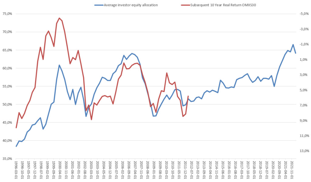
The result can be seen in the chart below. The blue line is the average investor equity allocation in Sweden (left y-axis). The red line is the subsequent 10 year real return for the Swedish stock market index OMXS30, expressed in percent as CAGR (right y-axis). Note that the right y-axis is inverse.
From just looking at the chart we can see that there is some kind of relationship between the two series. However, it is far from a perfect fit. Actually, the R-squared is only a meager 0,31 for the whole time period. It seems that something changed around 2003. If you divide the data in two parts, we find that up to 2003 the R-squared is 0,78 and after 2003 it is 0,79. However, it is still lower than what Philosophical Economics were able to show for the US. And there is not a linear relationship that is stable throughout the whole period.
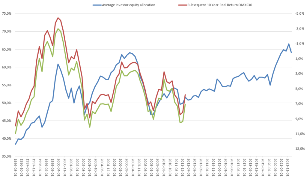
In the chart above I have used real returns, inflation adjusted by using the Swedish Consumer Price Index (KPI) from here. The overall picture does not change if we use nominal returns instead, as can be seen in the chart below. The green line is the subsequent 10 year nominal return for the Swedish stock market index OMXS30.
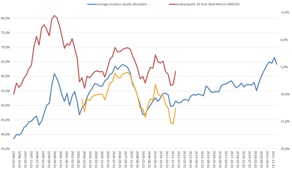
I would prefer to use total returns that also includes dividends, instead of a price index. However, I could only find free data going back to 2002 for OMXSGI, the total return index. Here it is in yellow, in the chart below. The correlation is actually a bit higher, with an R-squared of ~0,86, compared to ~0,78 for the price index for the same period. But this is obviously not enough data to prove anything.
This is clearly not enough to make me feel confident in trying to use this indicator for making real investment decisions. However I am not ready to give up my search for a predictor of market return. I am not even finished yet with my investigations of the average investor equity allocation.
Some of the questions I want to investigate further:
What is the correlation further back in time? I have found older data sets in Statistikdatabasen for the financial accounts going back to 1970. Now I also need to find data for the stock market index going back that far. Preferably the total return index. That should be the easy part, but I actually have not found any free source for this yet.
Why is there not a stable linear relationship between the equity allocation and the subsequent market return through the whole time period? Did something change after the IT-bubble that affected the relation? The equity allocation in Sweden seems to be lower during the IT-bubble than it was before the financial crisis of 2008. While in the US it is much higher during the IT-bubble. Is this correct, or am I using the data in some incorrect way?
Does the delay in reporting of the financial accounts impact the predictive power of the indicator? The results for one quarter is not reported until more than one whole quarter later. For example, the Q1 data is reported in July. Would it be possible to approximate the current average investor equity allocation by adjusting for how the prices of equities and bonds have changed since the end of last quarter?
Can investor surveys be used instead? There are publicly available surveys where investors are asked how high their equity exposures are. Will they show the same correlation to subsequent equity market returns?
Granted that I eventually find an indicator with predictive power, how could I incorporate this into my investment process? I need to decide upon a lot of concrete implementation details. At what level of average investor equity allocation would I reduce my equity exposure and what would be required for me to increase it again? How do I minimize turnover and associated fees? Is there some other Growth or Trend indicator that I should use in combination?
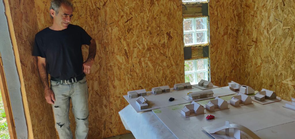
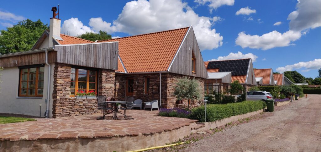
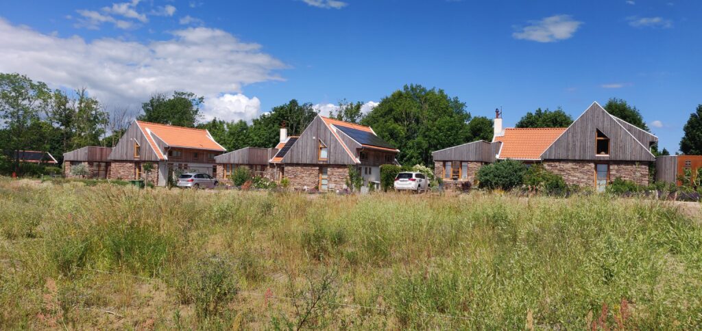
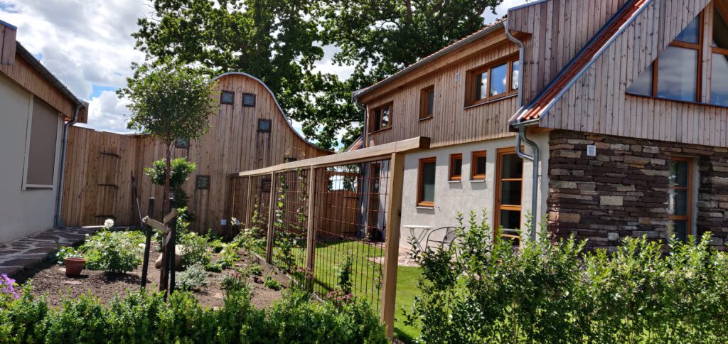
I stumbled upon an unusual and beautiful new neighbourhood the other day. We were visiting Capellagården at southern Öland. We noticed a sign that said “Artie visningshus” (Artie Showcase houses) when we were about to leave. I am happy that we chose to follow the sign. It turned out to be one of the most beautiful new housing development I have seen.
We were lucky enough to stumble upon Jahan, the architect, initiator and master builder of the project. He showed us around in the area. He told us it was the project of his life. He is also a smith and a glass blower. The lamps and other details in the neighbourbood are created by his hand. The limestone for the facades are reused from old stone barns.
Jahan said it took 12 years to get all the permit needed from the municipality. I am astonished he had the determination to keep on. I do not know the reasons for the long process in this particular case. However, I know from my 10 years of working as a municipal planner that it is usually a very slow and tedious process to get a new zoning or detailed development plan. Big actors have several projects they can spread the risks between and they often manage to push the additional costs for delay to the home owners. Small actors with only one project in their portfolio must be able to bear a very high level of risk. I often wonder how many amazing projects like these are never realised because the uncertainty and the delays were unbearable. This is a big loss for us all and for Sweden.
I highly recommend seeing this project for yourself. My snapshots below does not do it justice. And the neighbourhood will continue to evolve. Next time there will be something new to see. Here is the Google maps link.